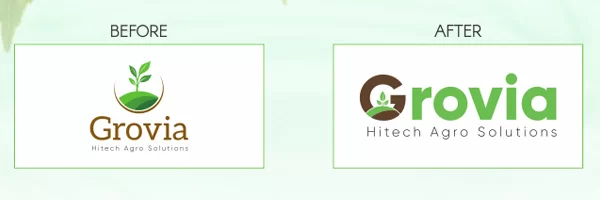
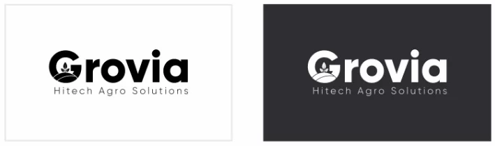
We rebranded their business from the ground up. We suggested structural related name concepts that are highly unique among their competitors. We took a very close look at their new logo, which was a continuation of the existing one but not exact. We focus on the octagon as a figure to create the infinite logo, a unique typography and the symbol make the logo breathe the same harmony. The shape of the new logo enhances the dynamics and becomes the main identifier, combining the elements of visual identity in a single system.
LOGO
LOGO
LOGO
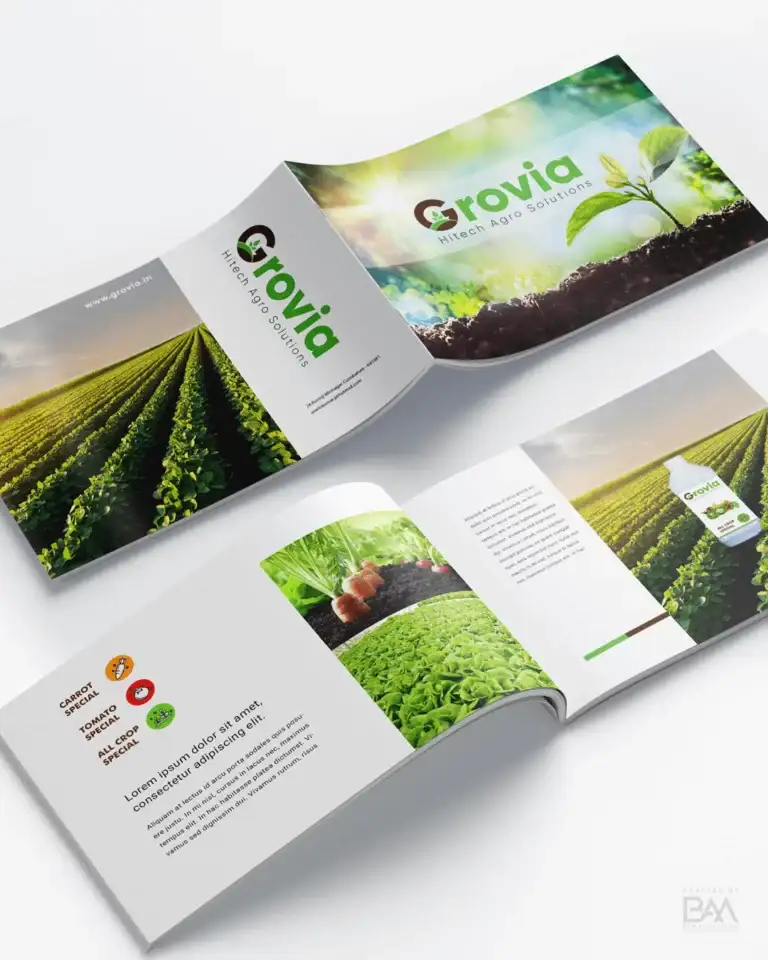
A Pioneer in the Hitech Agriculture industry, Grovia aims to take people to a new level of advancement in the newest, most modern and most advanced scientific venture with limited resources in agriculture, Previously, Grovia was known as Hitech Agro Solutions. They Specializes in the construction and operation of poly houses, which are basically naturally climate-controlled structures with a variety of uses. They tend to grow vegetables and flowers using plastic grow bags without the use of soil.
Logo Design Concept
A Pioneer in the Hitech Agriculture industry, Grovia aims to take people to a new level of advancement in the newest, most modern and most advanced scientific venture with limited resources in agriculture, Previously, Grovia was known as Hitech Agro Solutions. They Specializes in the construction and operation of poly houses, which are basically naturally climate-controlled structures with a variety of uses. They tend to grow vegetables and flowers using plastic grow bags without the use of soil.
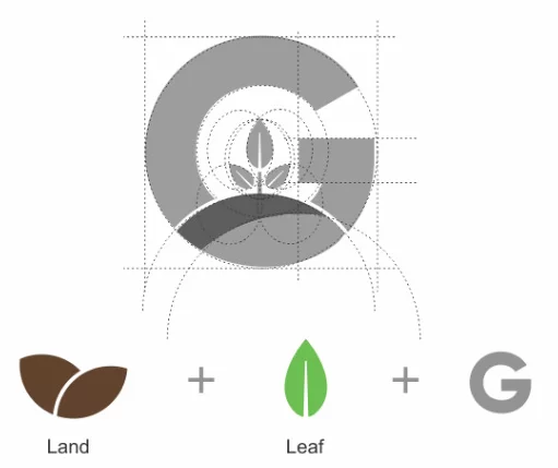
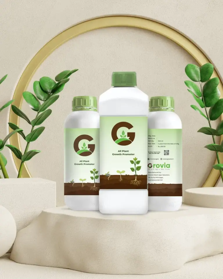
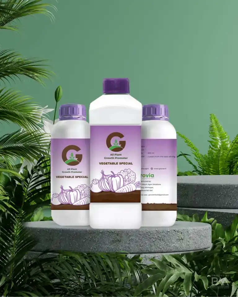
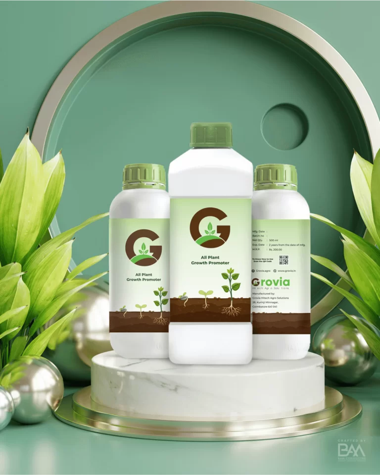
The revamped logo of Grovia is the combination of Leaf, Land and the first letter of the brand G. The Leaf like structure defines the vegetation crop and the land structure represents the soil, mail core substance for vegetable cultivation and finally, the letter defines the brand name and value in the people’s mind
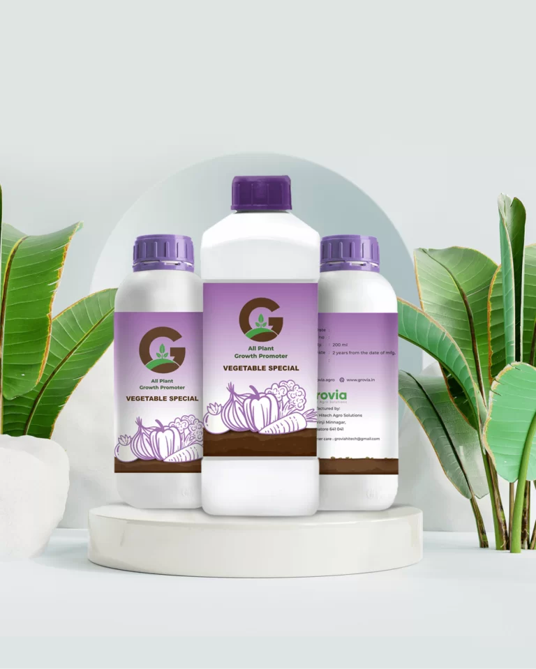
Packaging
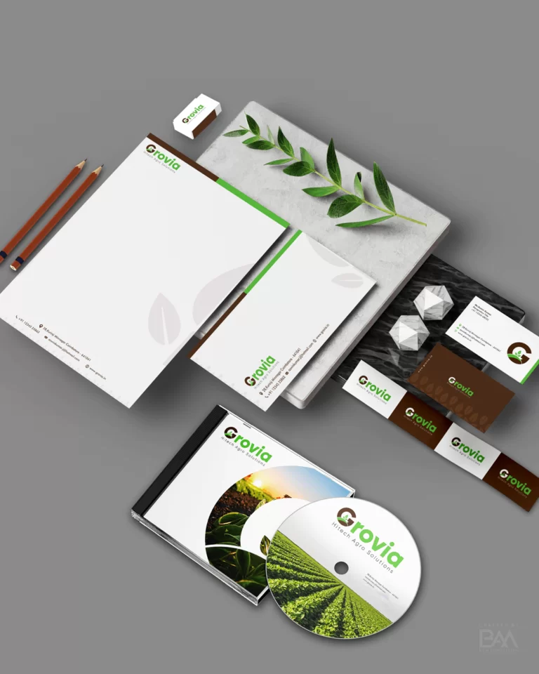
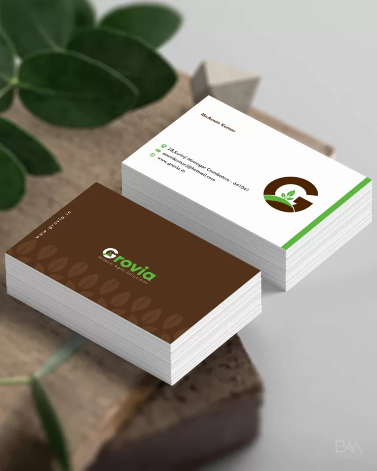
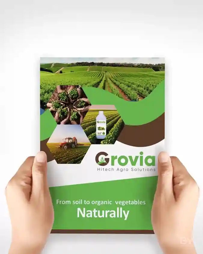
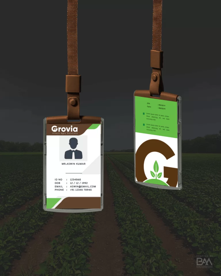
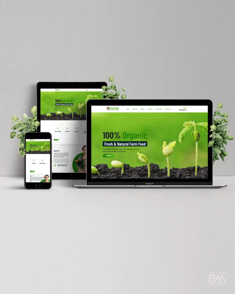
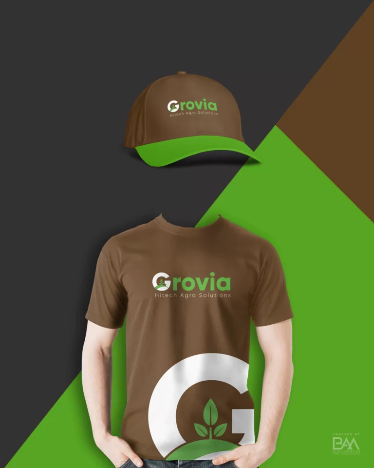
BRAND DEVELOPMENT
BRAND DEVELOPMENT
BRAND DEVELOPMENT
Brand Coloraturas
Primary Color
The secondary color was brown it compliments the primary color depict the feel of the business through the logo.
#5EC232
#5EC232
#5EC232
Primary Color
The secondary color was brown it compliments the primary color depict the feel of the business through the logo.
Brand Typography
The secondary color was brown it compliments the primary color depict the feel of the business through the logo.