Logo / Brand Development / Digital Creatives / Brand Promotional Activities
Nalvanam
BAM consulting collaborated with Nalvanam to elevate their presence in the indoor plant market. We started by designing a distinctive and memorable logo that encapsulates the essence of Nalvanam, symbolizing their mission to create frondescence environments. Our comprehensive brand development efforts established a strong and cohesive identity that aligns with their mission. We designed digital creatives that effectively convey Nalvanam’s brand message and visually engage their target audience. Additionally, we organized brand promotional activities to boost their market presence and attract corporate clients looking to enhance their spaces with greenery.
Nalvanam
The Name
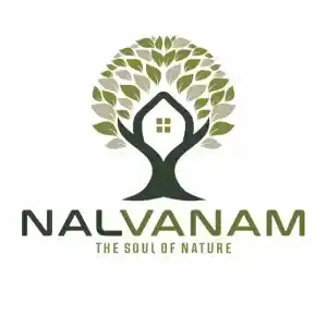
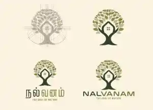
The name NALVANAM is originated from Tamil word, represents, Nal(Nalla) means Good and Vanam means forest or a large area covered chiefly with trees and plants. It is space to shop indoor plants in a friendly environment. Our goal is to develop a modern and luxuries brand icon for Nalvanam.
Nalvanam values represent
Positivity
Bloom
Growth
Serenity
Brand Logo
Brand Logo
Brand Logo
The indoor plants into your living space you will begin to see upgrades to your wellbeing, positivity and overall happiness. The visual identity was inspired by the shape of the leaves, growing tree and home. Each of these symbols represents the unique natures of Nalvanam. The leaves structure used to represent the growth and the first two letters of brand name N and V forms the tree and house that come onto our daily lives. The combination of all elements of the brand results in a solid and remarkable brand, with an optimistic feeling at its roots for Positivity and serenity.
The logo colours are professional and express the nature of the brand, Nalvanam is originated from the green environment of forest. Seeing greenery and nature help us feel more relaxed and calm, which thus benefits your consistent mind-set. Here the primary color is green, it identifies the nature of the brand, and the secondary colors are based out from the primary color for a corporate characterisation.