About Project

Bam consulting provided Paarambhariya with a comprehensive branding strategy to elevate their presence in the sweet shop market. We designed a distinctive logo that captures Paarambhariya’s traditional essence and developed practical, attractive packaging to preserve freshness and enhance shelf appeal.
Our brand development efforts established a cohesive identity reflecting Paarambhariya’s quality and heritage. We created promotional designs to effectively communicate their brand message and managed their social media presence, crafting engaging content to foster community interaction and drive traffic to their store.

Our Role:

PAARAMBHARYIA.COM SWEETS

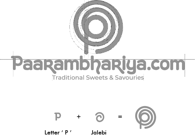
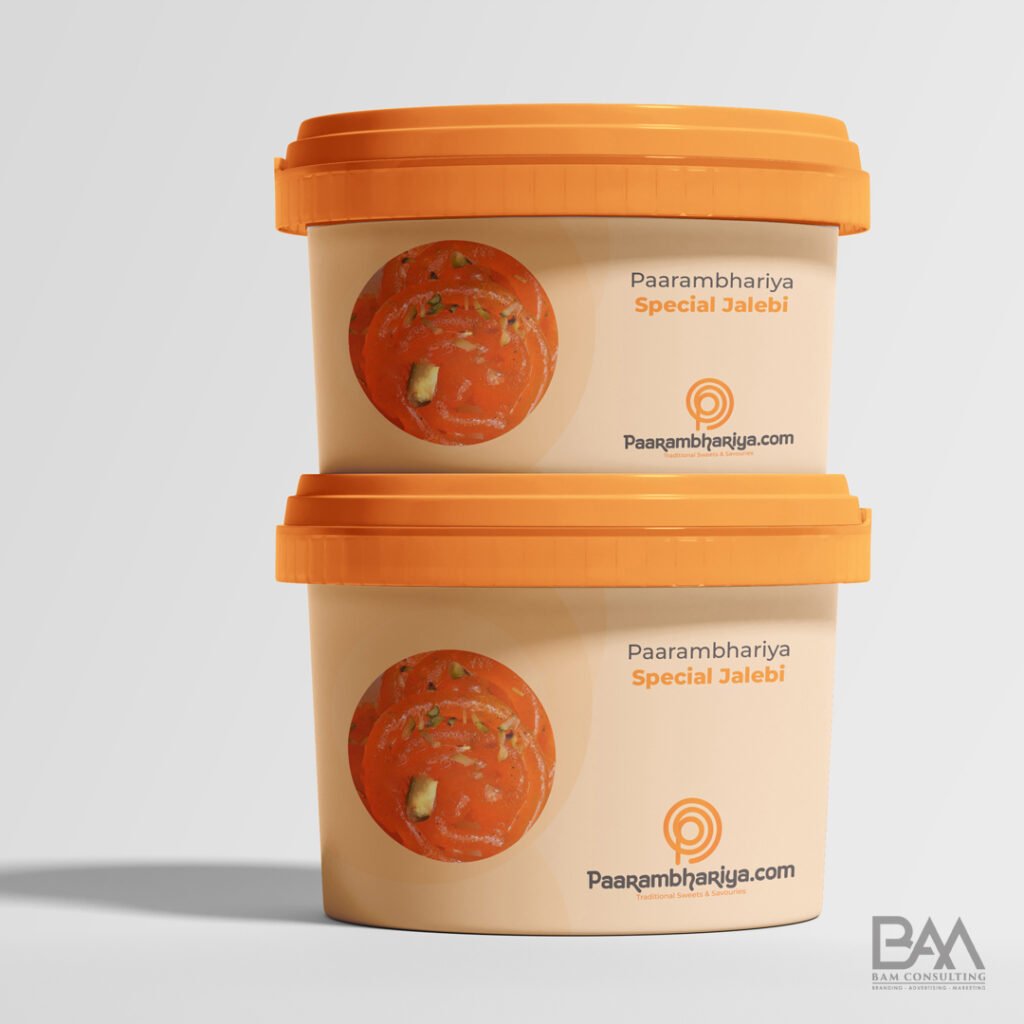
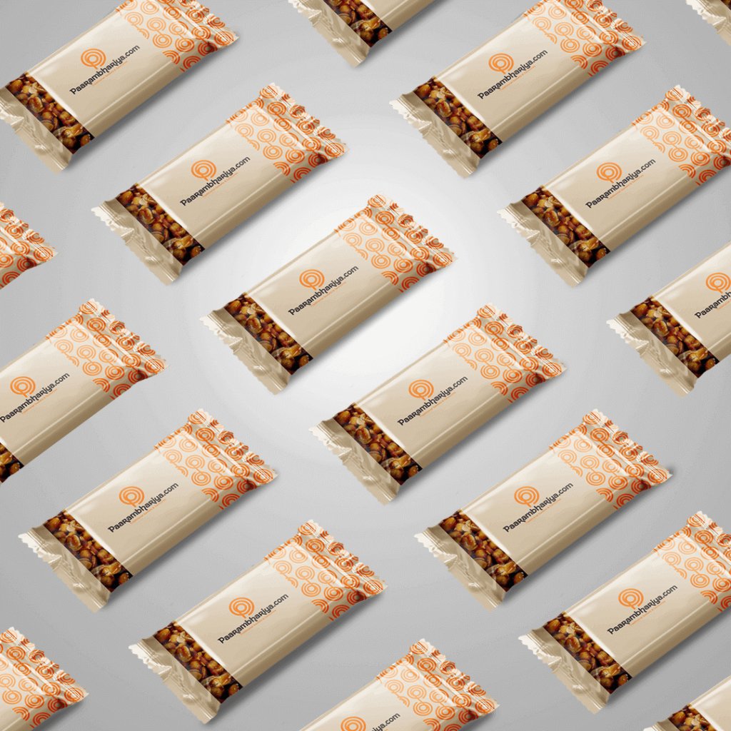
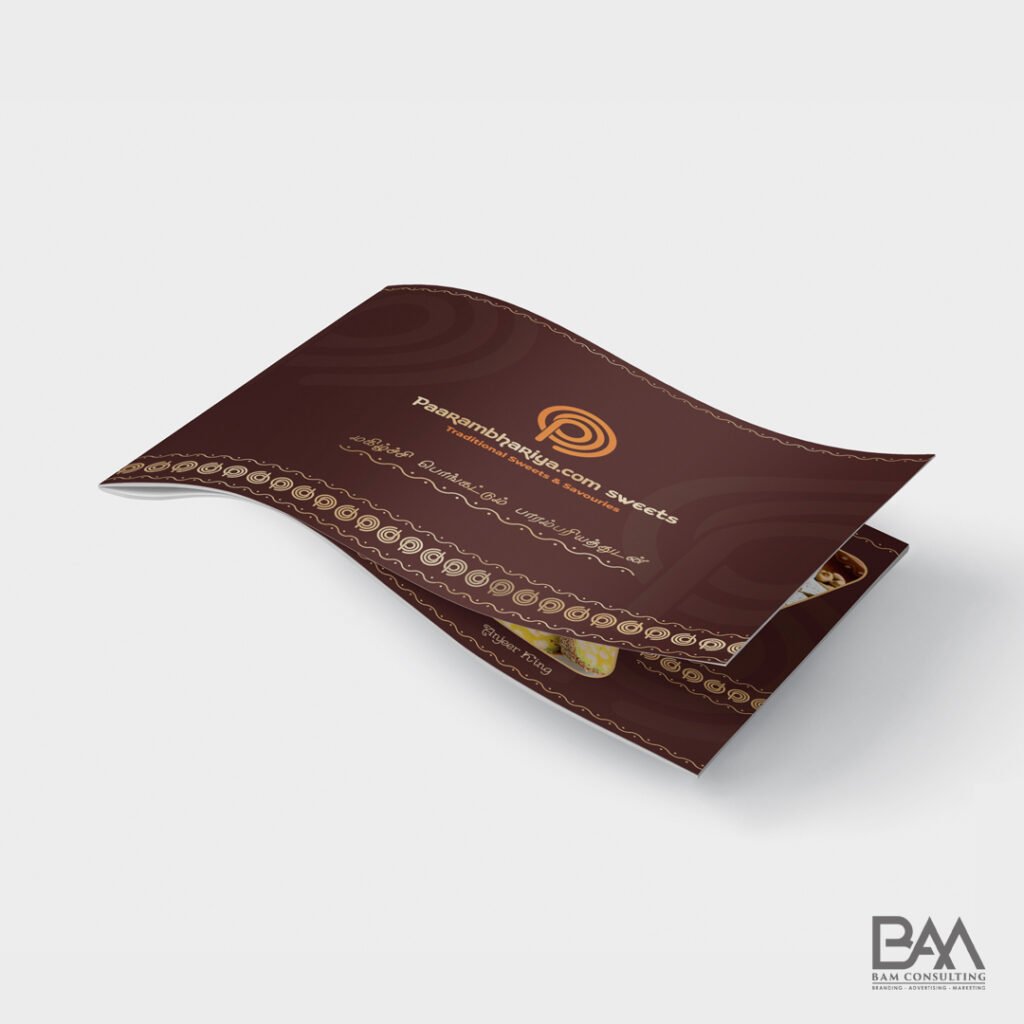
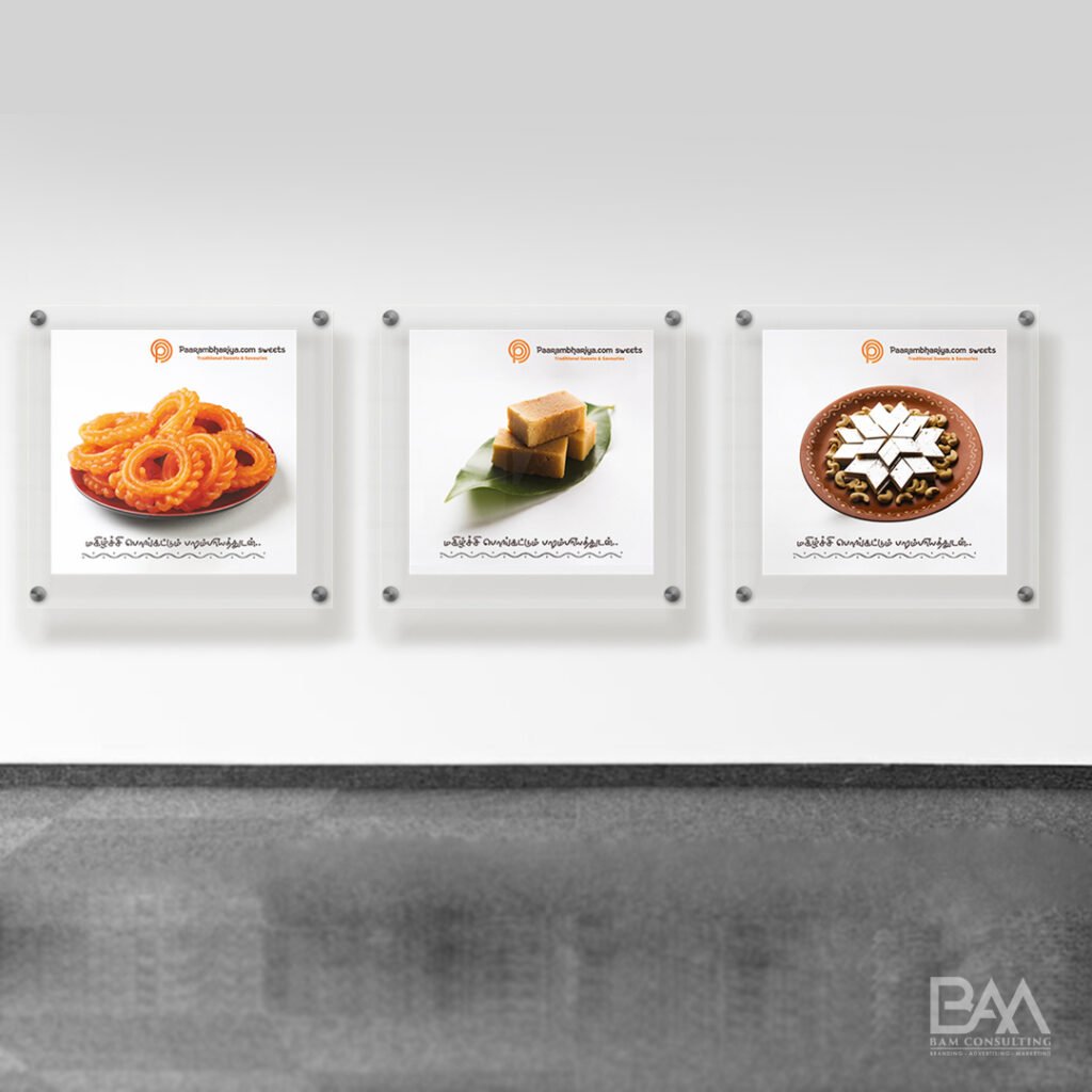
Paarambhariya maintains traditional tastes in its products, giving them an edge over their competitors. Our thoughts, ideas, research and efforts led to the development of an elegant and traditional brand identity. The aim was to make a classic and minimalist brand for Paarambhariya.com sweets to uphold the royal lineage of paarambhariyam to appeal to a wide audience.

Logo Concept

As a concept, we have designed this around the iconic sweet (Jilebi) of Paarambhariya.com. The swirl is a representation of the shape of the Jilebi. As a result of the letter P, this brand became recognizable.

Brand Coloraturas

#ff750e

ff890e

#3d3333

Brand Typography

We used your prefernce color combo as White and wooden brown and the orange represents the texture of sweets.
Typography plays a vital role in the brand identity. Each font has its own feel.Fonts depends upon the business. We used the Kingthings Hand.

Iconography

Traditional

Super

Sweet

Tasty

Delivery

Coffee

Varieties

Snacks

About

Packaging

Brand Experience

YOUR PERFECT BUSINESS PARTNER SOLUTION

+91 97900 03636

We are the pilot of brands to turn new-to-the-world ideas into sustainable business models and growth. Our Brand Management services all aimed at strongly connecting your brand with the audience.