X
- BAM Consulting
- Portfolio
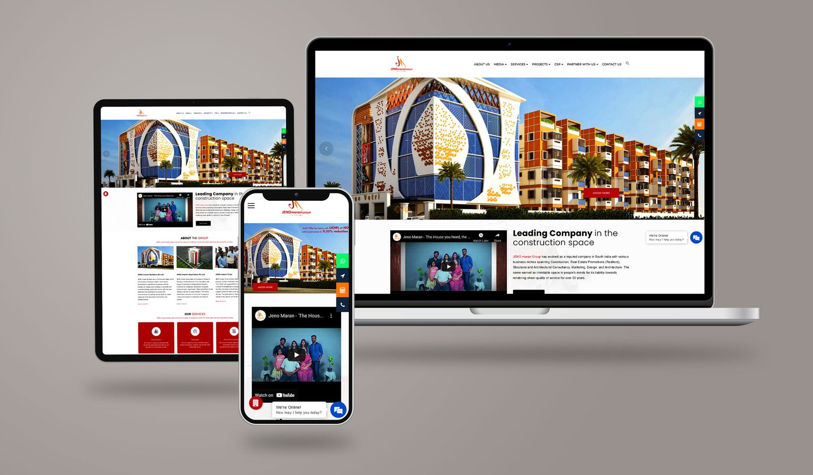
- JENO maran Group
JENO maran Group
About Project
We rebranded their business from the ground up. We suggested structural related name concepts that are highly unique among their competitors. We took a very close look at their new logo, which was a continuation of the existing one but not exact. We focus on the octagon as a figure to create the infinite logo, a unique typography and the symbol make the logo breathe the same harmony. The shape of the new logo enhances the dynamics and becomes the main identifier, combining the elements of visual identity in a single system.
Our Role:
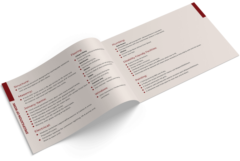
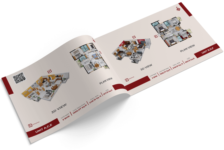
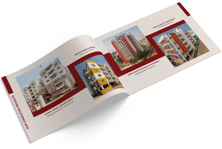
- Brochure design
JENO maran Group
Website Design
Brochure Design


